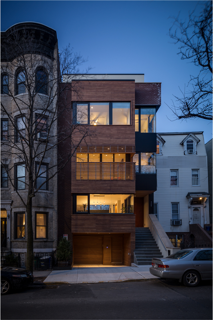
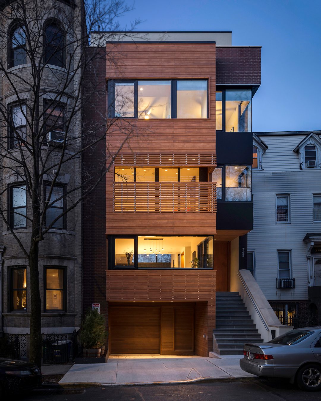
A couple of months ago, I had the awesome opportunity to photograph a Brooklyn townhouse designed by the super-talented team at RESOLUTION: 4 ARCHITECTURE. The goal of the photoshoot was to not only document the space and capture the design, but to also create some "sexy" images that would help bring home a win in this year's AIA Brooklyn + Queens Design Awards. One of the key features of this house are in the design of the façade:
"The front façade combines brick, speaking to the neighbors, a cedar rainscreen, and black aluminum panels. Maintaining an indoor-outdoor connection throughout was important to the clients, so despite the narrow 25-foot lot, balconies and terraces open each floor up to exterior spaces."
- RESOLUTION: 4 ARCHITECTURE
So going into the shoot, we knew that a beautiful image of the facade was needed and I wanted to give it some extra love and attention...
Here is the base image (with no additional lights added). This was taken several minutes after sunset to capture a balance of the darker blue sky and the warm inviting interior. But the warm tones of the cedar are lost and blend in with the brick material a little too much for my liking.
Here are a selection of frames taken with pops of warm light from my handheld strobe. As you can see, I am using the strobe to highlight the cedar rainscreen, the planters to the left and to add a bit of glimmer to the street to draw the viewer in. Also in my other hand is a tablet wirelessly tethered to the camera so I know exactly where the light is being added.
Here is the result of compositing some of those light-painted frames with the original base image. Huge improvement, but not completely finished.
After some additional editing, cropping, and removal of elements that were distracting from the house, this is where we ended up. I really enjoy the extra warmth and highlights that those lights added back to the house. Well worth the extra time and numb fingers from the cold blistering winter winds we endured.
Architect: RESOLUTION: 4 ARCHITECTURE
AIA Brooklyn + Queens Design Award 2018 Winner - Award of Excellence


