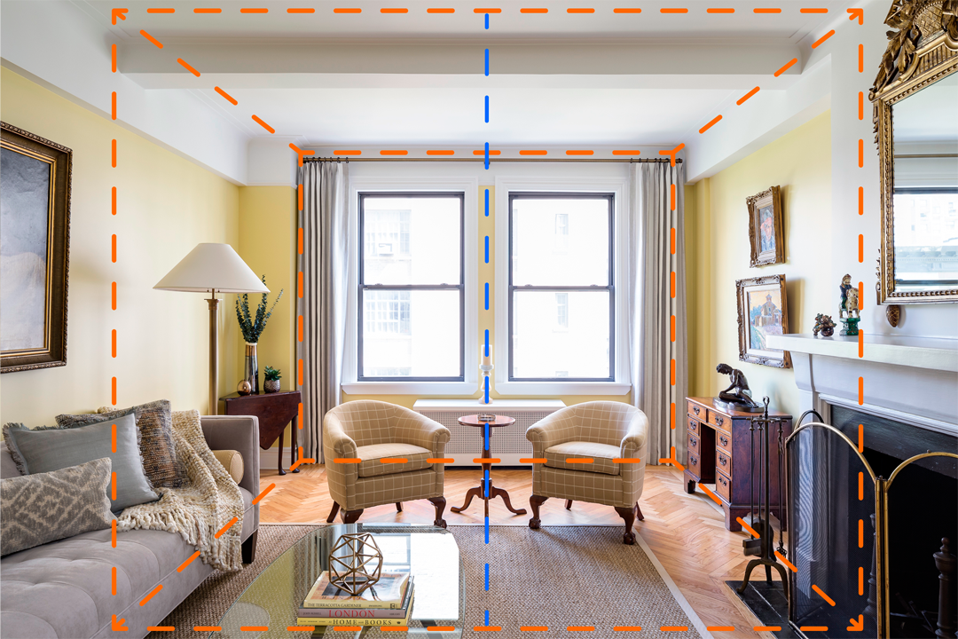
I thought it would be a fun idea to share some behind the scenes information about how a recent architectural photo came together.
One of the most important elements of a photo is the composition, and this is always my starting point when beginning to photograph a space. Anyone that has been on an architectural photoshoot with me knows that I love one point perspectives. I believe it is one of the best ways to highlight the architectural features of a space.
The camera is not exactly in the middle of the room, instead it is precisely in the middle of the two windows. The one point perspective works well here architecturally and also features the interior design of the space.
This is a pretty good starting point, but there are some issues I wanted to fix. I love the direction of the natural light, creating interesting shadows especially on the seating area, pillows and throw, but the amount of natural light needed to light the whole space creates over exposure in some areas. You can see there is a loss of detail in the artwork, the yellow walls, the desk, and the wood flooring closest to the window.
The use of a polarizer and some fill lighting here has cut down the hot spots and brought detail back into areas that were once lost. The paintings look much better, the yellow paint color of the walls have returned, and the wood tones are more accurate. But there is still one issue that bothers me...
I used a gray throw that we didn't use for staging the scene to block the left window, which was creating reflections on the glass coffee table in the foreground. Note: there is an iPad laying on the seat in front of me which gives me a live view from the camera so I can make sure I am fully blocking the window.


I hope you found this post helpful and/or interesting. I would love to do this again in future posts, so you have any questions or comments feel free to comment below.
Space designed by: Archetype Design Studio


